Project Details
Client: Cheeseland Inc.
Date: January 2013
Skills: Graphic Design
Logo Design
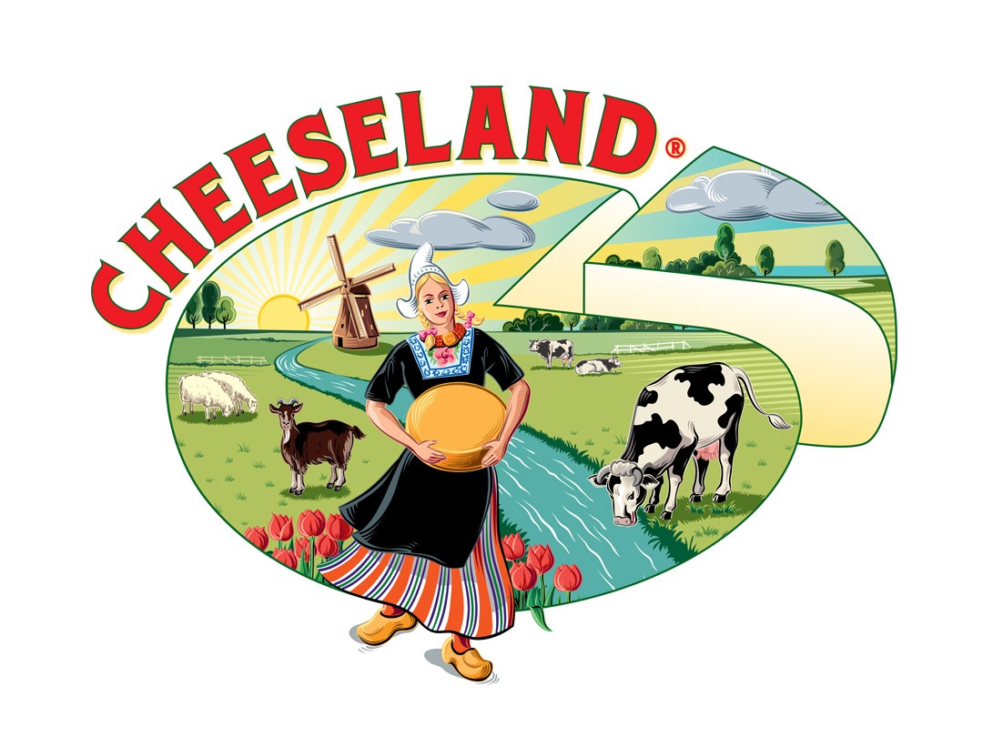
Cheeseland Inc. wanted a new look for their out of date logo. They needed an image that represented the company’s product, history and positive work environment. They wanted something that gave the viewer a happy feeling. In addition, the logo referenced the Netherlands history of cheese making and the excellent quality of life the animals who produce the milk enjoy. I designed the concept and of the logo and sketched out the illustration. I worked in collaboration with an Italian illustrator to complete the drawing and the logo came together.
Ellen, I really like the colors and the girl it gives you a positive feeling when I look at the whole picture!
Thanks a lot!
The logo is really fantastic! I like everything about it and am looking forward to seeing it in use in promo materials, hearing some feed-back from the public. It is bright, fun, memorable, a nice combo of classic tradition and modern, it is European, very Dutch and represents CheeseLand well – congrats, great job!
